import numpy as np
import pandas as pd
import matplotlib.pyplot as plt
from sklearn.cluster import KMeans
from sklearn.metrics import silhouette_score
from sklearn.datasets import make_blobs
import seaborn as sns
from sklearn.cluster import KMeans
import timeSegmentation: Creating a K Means function
In this post I will briefly expain K-means and attempt to to build my own k-means function used in clustering and segmentation.
1. Background on K Means and Clustering
K-means is a popular method in unsupervised machine learning used to clasify datapoints into distinct groups. K means partitions data points into some \(K\) number of distinct non-overlapping subsets or clusters that minimizes the variation within each cluster. It is typically used for its simplicity and efficiency in processing large data sets - it’s computational complexity is generally \(O(nkt)\), where \(n\) is the number of data points, \(k\) is the number of clusters, and \(t\) is the number of iterations. This makes k-means faster compared to other clustering algorithms like hierarchical clustering, especially as data size grows.
K means is used in a variety of business applications such as Market Segmentation, Document Clustering, and Image Segmentation. However, it does have some limitations that need to be taken into account when using this unsupervised machine learning method. First, K-means assumes clusters are spherical and equally sized, which can distort cluster assignments in real-world data. This could change how data points are assigned to each centroid. Additionally, it requires specifying \(k\) in advance, which is not always intuitive, and might distort one’s ability to cluster. However, we can use metrics such as within-cluster-sum-of-squares and silhouette scores to calculate our ideal number of K. Finally, the algorithm is sensitive to the initial selection of centroids, which can lead to different clustering results.
2. Steps in Creating a K Means function:
To create a Kmeans algorithm by scratch, we will follow 4 steps:- Initialization
- Assignment
- Update
- Iterate and Convergence
1. Initialization: Start by choosing k inital centroids
The first step in creating a Kmeans function is initialization. Suppose we have \(n\) points an X, Y axis, where each datapoint \(i\) corresponds to a specific row in a dataset. We can select \(k\) random points to serve as the inital centroids for the k-mean algorithm. Random initialization helps in spreading out the centroids initially, though it might affect the convergence and outcome, making the algorithm sensitive to the initial positions.
2. Assignment: Assign each data point to the nearst centroid
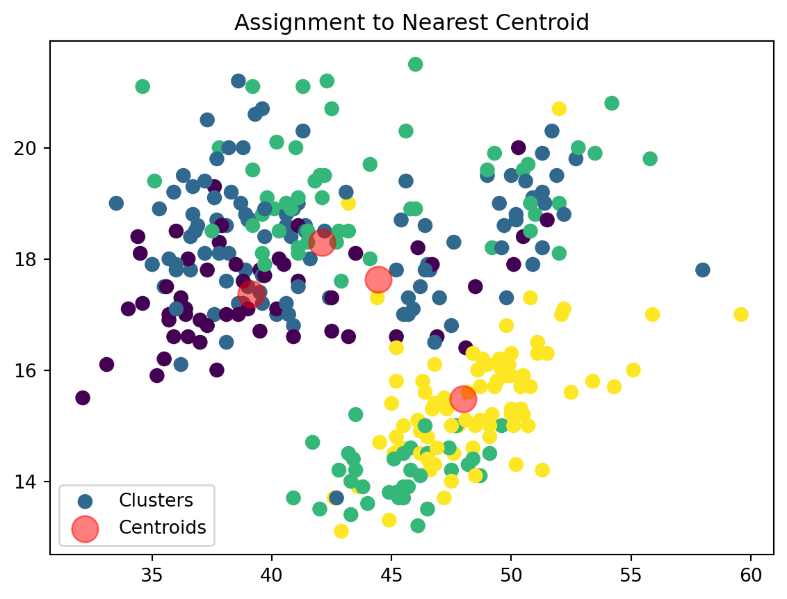
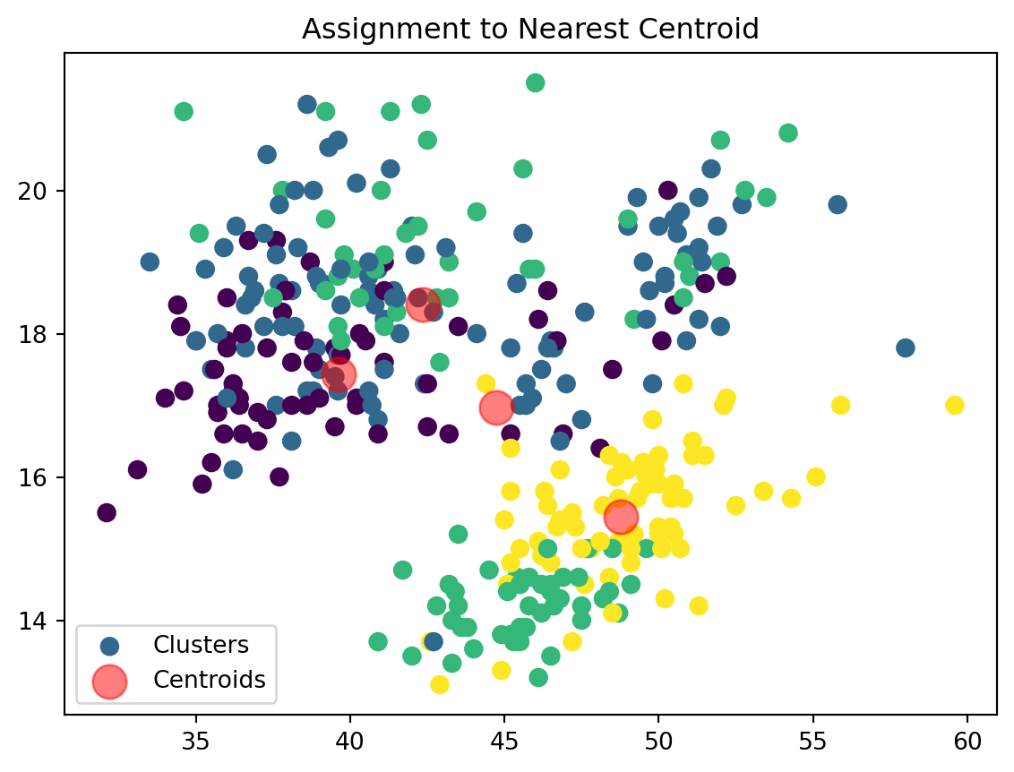
We then assign our datapoints to the closest centroid based on their euclidean distance. \[ \text{Euclidean Distance} = \sqrt{{x_i}^2 + {y_i}^2} \]
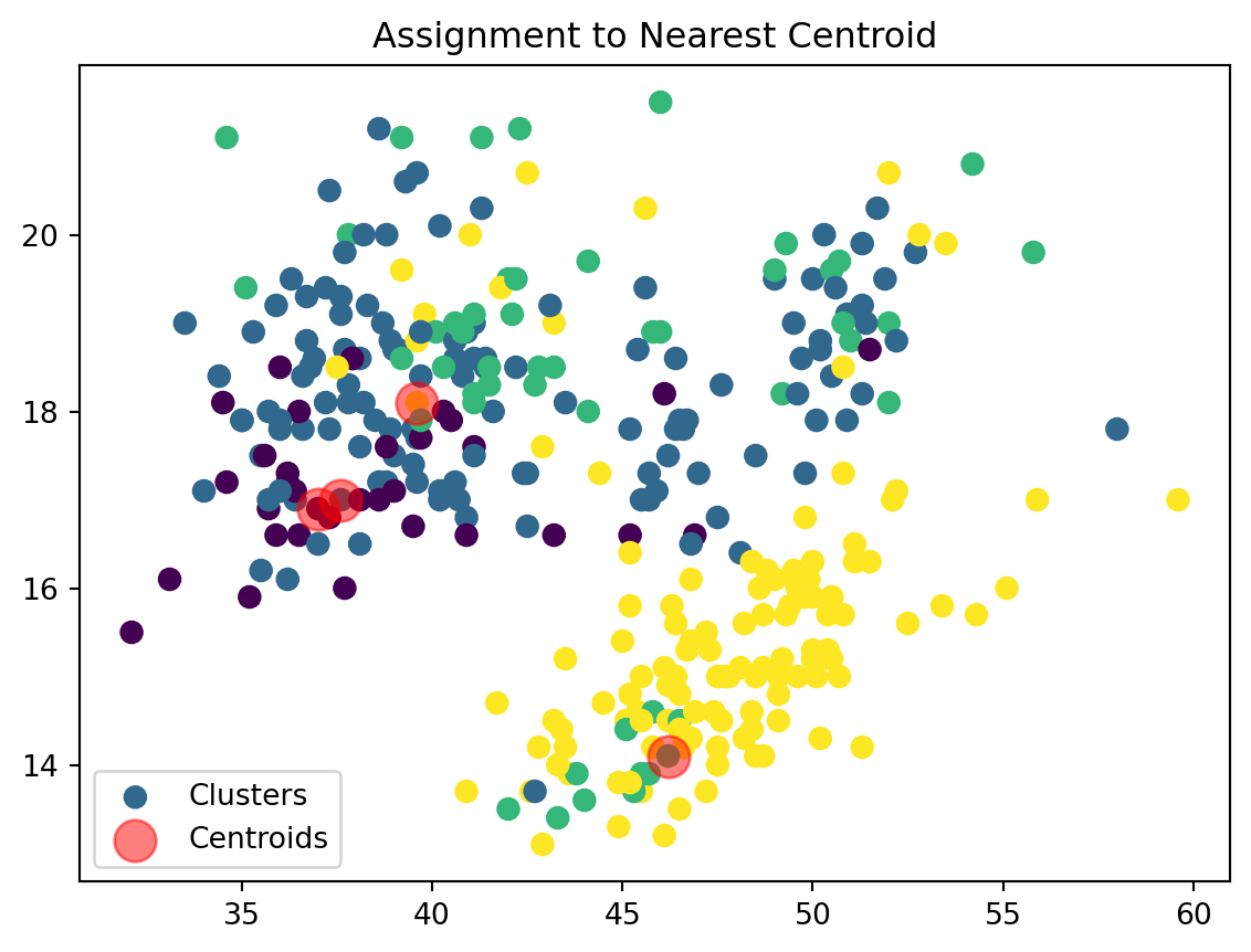
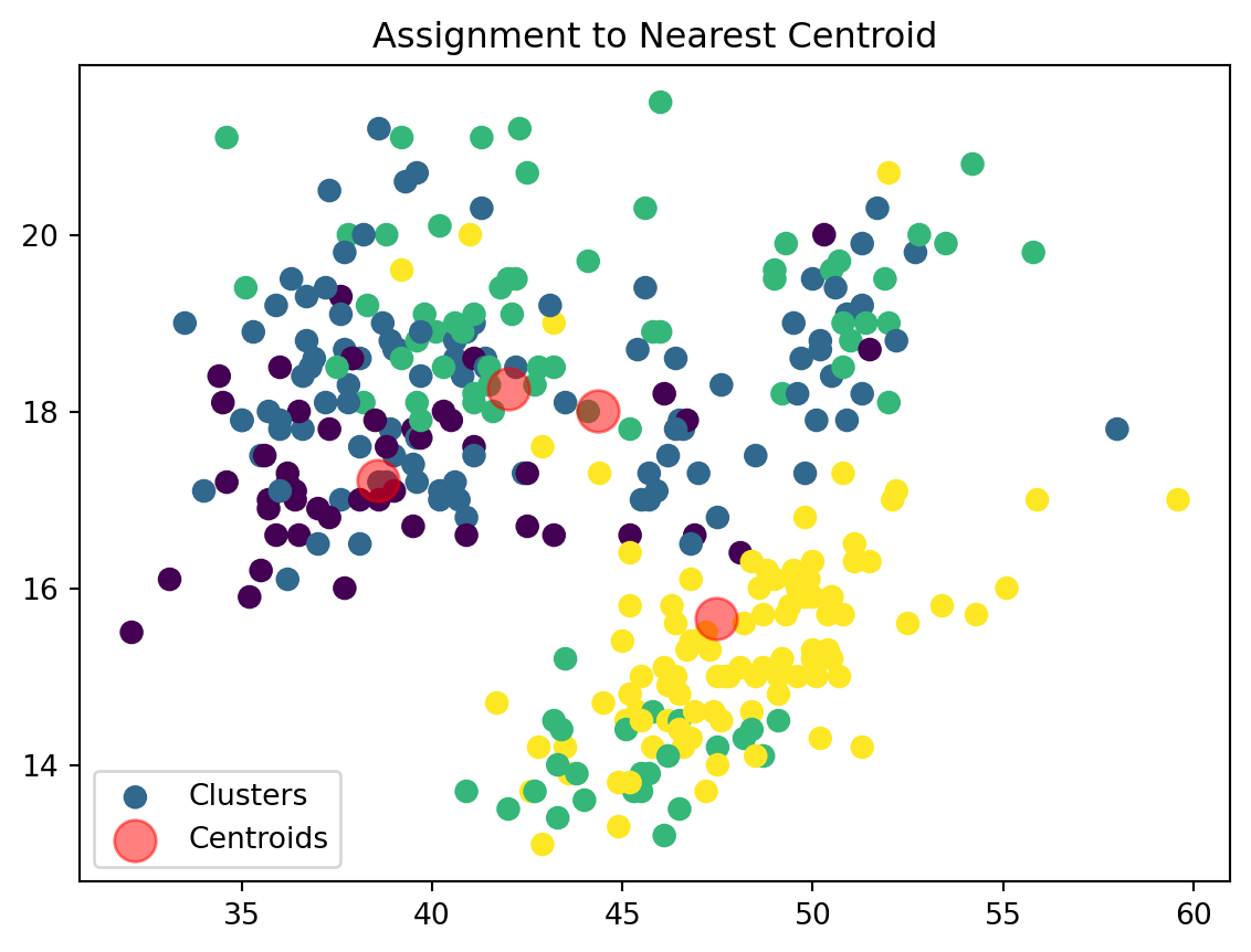
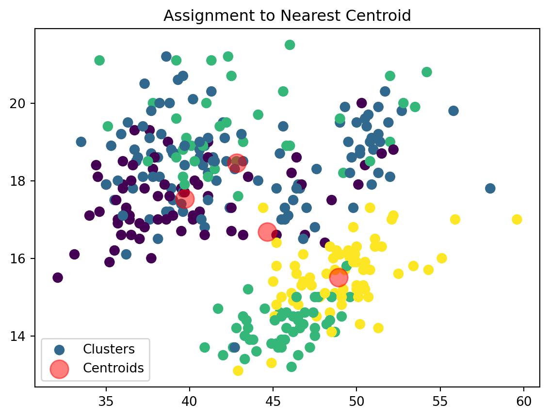
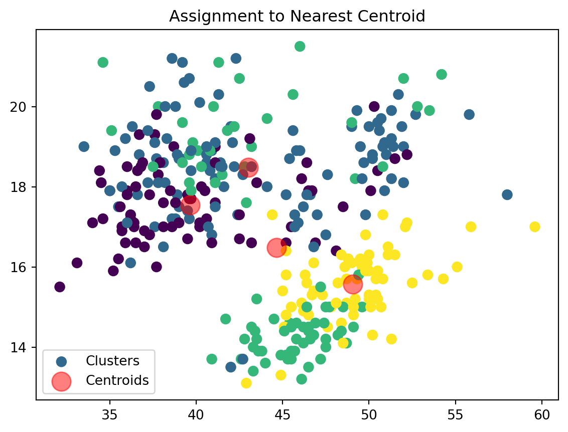
The points will be clusetered based on the centroid that minimizes this distance value. This forms clusters of points around centroids based on proximity. For a dataframe or a data set with more data that can be fit into 2 dimensions (i.e. x and y) we can continue to add additional points to our distance formula to calculate the Euclidean distance. Therefore, if we have a dataset with 3 columns, such as X, Y, and Z, we can find our distance between the points as: \[ \text{Distance} = \sqrt{{x_i}^2 + {y_i}^2 + {z_i}^2} \]
3. Update: Recalculate centroids as the mean of all points assigned to each cluster
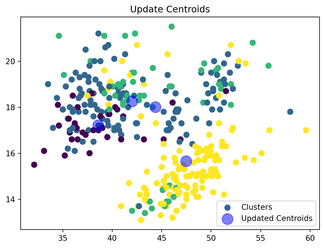
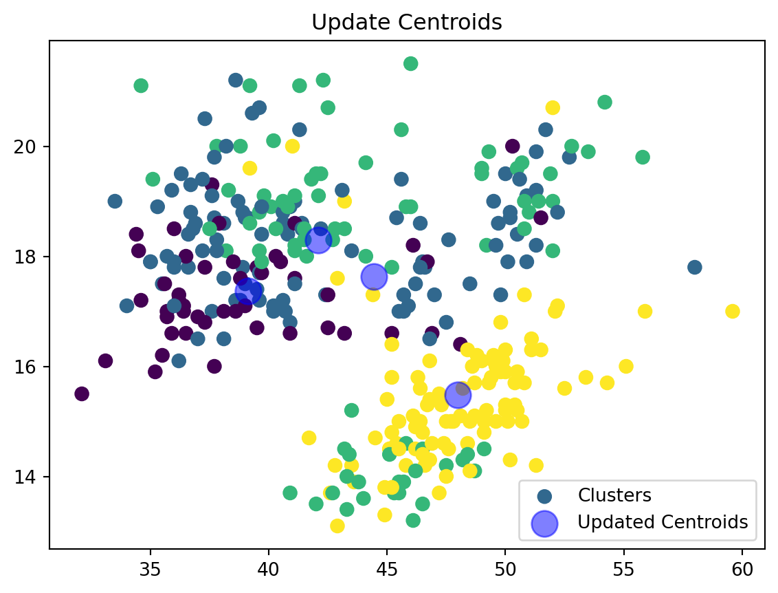
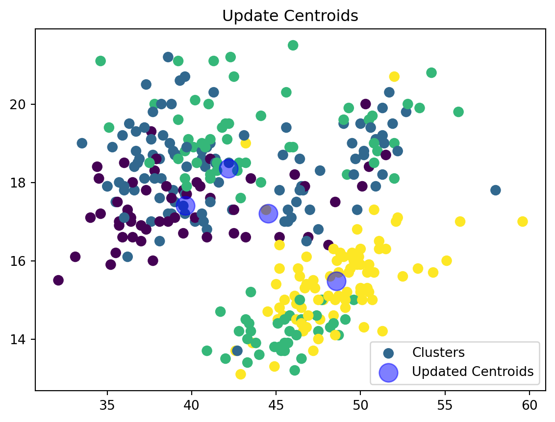
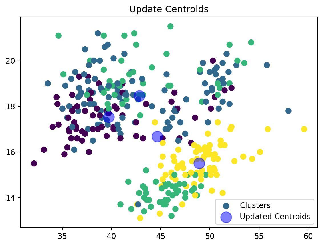
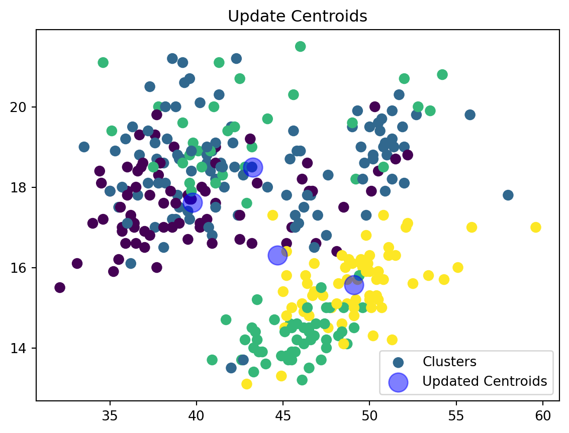
After all points have been assigned to centroids, we recalculate each centroid’s position as the mean (average) of all points that have been assigned to that centroid. This adjustment of centroids to the center of their respective clusters is what potentially reduces the total variance within each cluster.
4. Iterate and Convergence: Repeat the assignement and update steps until the centroids do not change or the changes are below a certain threshold.
After updating the centroids, the shift in their positions (measured as the Euclidean distance between the old and new positions) is calculated. If the maximum shift across all centroids is less than a predetermined tolerance level, the algorithm stops, assuming it has reached convergence. This check prevents endless adjustments when centroids have effectively stabilized.
3. Creating a KMeans function
Initialize Centroids:
def initialize_centroids(data_np, k):
    indices = np.random.choice(data_np.shape[0], size=k, replace=False)
    centroids = data_np[indices]

    plt.scatter(data_np[:, 0], data_np[:, 1], color='gray', alpha=0.5, label='Data Points')
    plt.scatter(centroids[:, 0], centroids[:, 1], color='red', s=200, alpha=0.5, label='Initial Centroids')
    plt.title('Initialization of Centroids')
    plt.legend()
    plt.show()

    return centroids
Here we are randomly selecting some \(k\) number of centroids from our datapoints and labeling them on our graph.
Assign Clusters:
def assign_clusters(data_np, centroids):
    distances = np.sqrt(((data_np - centroids[:, np.newaxis])**2).sum(axis=2))
    nearest_centroids = np.argmin(distances, axis=0)

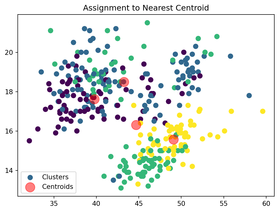
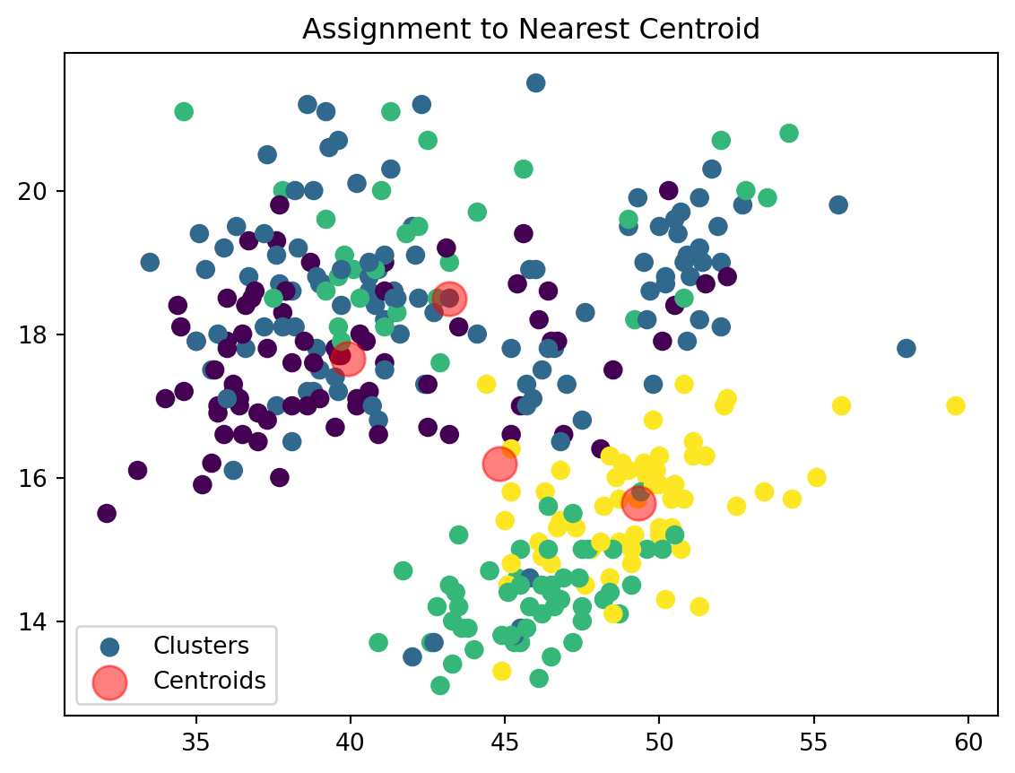
    plt.scatter(data_np[:, 0], data_np[:, 1], c=nearest_centroids, s=50, cmap='viridis', label='Clusters')
    plt.scatter(centroids[:, 0], centroids[:, 1], s=200, color='red', alpha=0.5, label='Centroids')
    plt.title('Assignment to Nearest Centroid')
    plt.legend()
    plt.show()

    return nearest_centroids
We are now assigning points to their respective centroids with the goal of minimizing their distance.
Update Centroids:
def update_centroids(data_np, nearest_centroids, k):
    new_centroids = np.array([data_np[nearest_centroids == j].mean(axis=0) for j in range(k)])

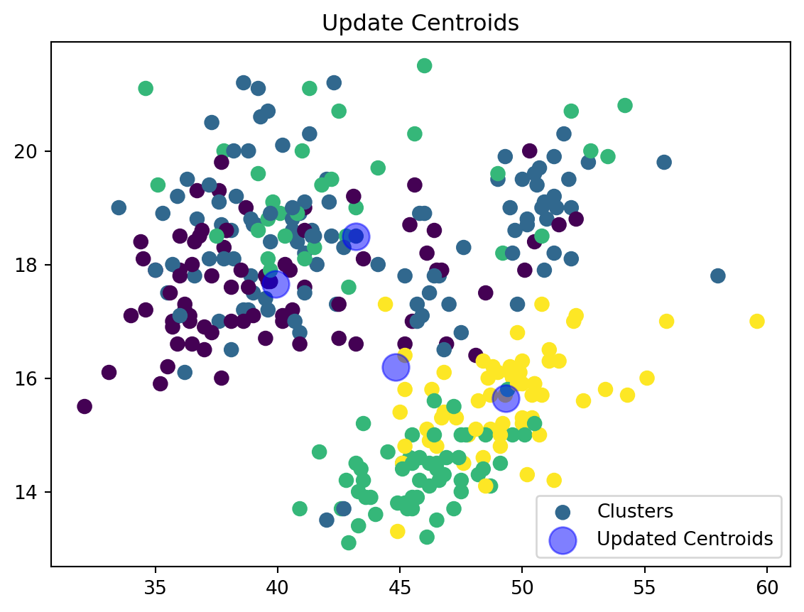
    plt.scatter(data_np[:, 0], data_np[:, 1], c=nearest_centroids, s=50, cmap='viridis', label='Clusters')
    plt.scatter(new_centroids[:, 0], new_centroids[:, 1], s=200, color='blue', alpha=0.5, label='Updated Centroids')
    plt.title('Update Centroids')
    plt.legend()
    plt.show()

    return new_centroids
We are now updating our centroid and cluster assignment based on the mean of the assigned points.
K Means
def k_means(data, k, max_iters=100):
    data_np = data.values
    centroids = initialize_centroids(data_np, k)
    trajectory = [centroids.copy()]  # To store centroids positions at each iteration

    for i in range(max_iters):
        nearest_centroids = assign_clusters(data_np, centroids)
        centroids = update_centroids(data_np, nearest_centroids, k)
        trajectory.append(centroids.copy())

        if np.all(trajectory[-1] == trajectory[-2]):
            break

    return centroids, nearest_centroids, trajectory
Movement of our centroids
def plot_centroid_movements(data, trajectory):
    data_np = data.values
    plt.figure(figsize=(10, 8))
    plt.scatter(data_np[:, 0], data_np[:, 1], color='gray', alpha=0.5, label='Data Points')

    # Plotting each centroid's trajectory
    colors = ['red', 'blue', 'green', 'purple']
    for i, trace in enumerate(np.array(trajectory).transpose(1, 0, 2)):
        # Plot line with 'o' markers for centroids
        plt.plot(trace[:, 0], trace[:, 1], '-o', color=colors[i % len(colors)], label=f'Centroid {i+1}')

        # Adding annotations for each centroid in each iteration
        for idx, point in enumerate(trace):
            plt.annotate(str(idx),  # this will be the iteration number
                         (point[0], point[1]),  # this specifies the position
                         textcoords="offset points",  # how to position the text
                         xytext=(0,10),  # distance from text to points (x,y)
                         ha='center',  # horizontal alignment can be left, right or center
                         color=colors[i % len(colors)])

    plt.title('Movement of Centroids Over Iterations')
    plt.xlabel('Feature 1')
    plt.ylabel('Feature 2')
    plt.legend()
    plt.show()
Here we are creating a plot to track the movement of our centroids over the various code iterations.
4. Running our KMeans
penguins = sns.load_dataset('penguins')
# Check for missing values
print(penguins.isnull().sum())

# Drop rows with missing values (optional, based on how you want to handle missing data)
penguins.dropna(inplace=True)
penguins_numerical = penguins[['bill_length_mm', 'bill_depth_mm', 'flipper_length_mm', 'body_mass_g']]
species 0
island 0
bill_length_mm 2
bill_depth_mm 2
flipper_length_mm 2
body_mass_g 2
sex 11
dtype: int64start_time = time.time()
centroids, labels, trajectory = k_means(penguins_numerical, k=4)
plot_centroid_movements(penguins_numerical, trajectory)
my_time = time.time() - start_time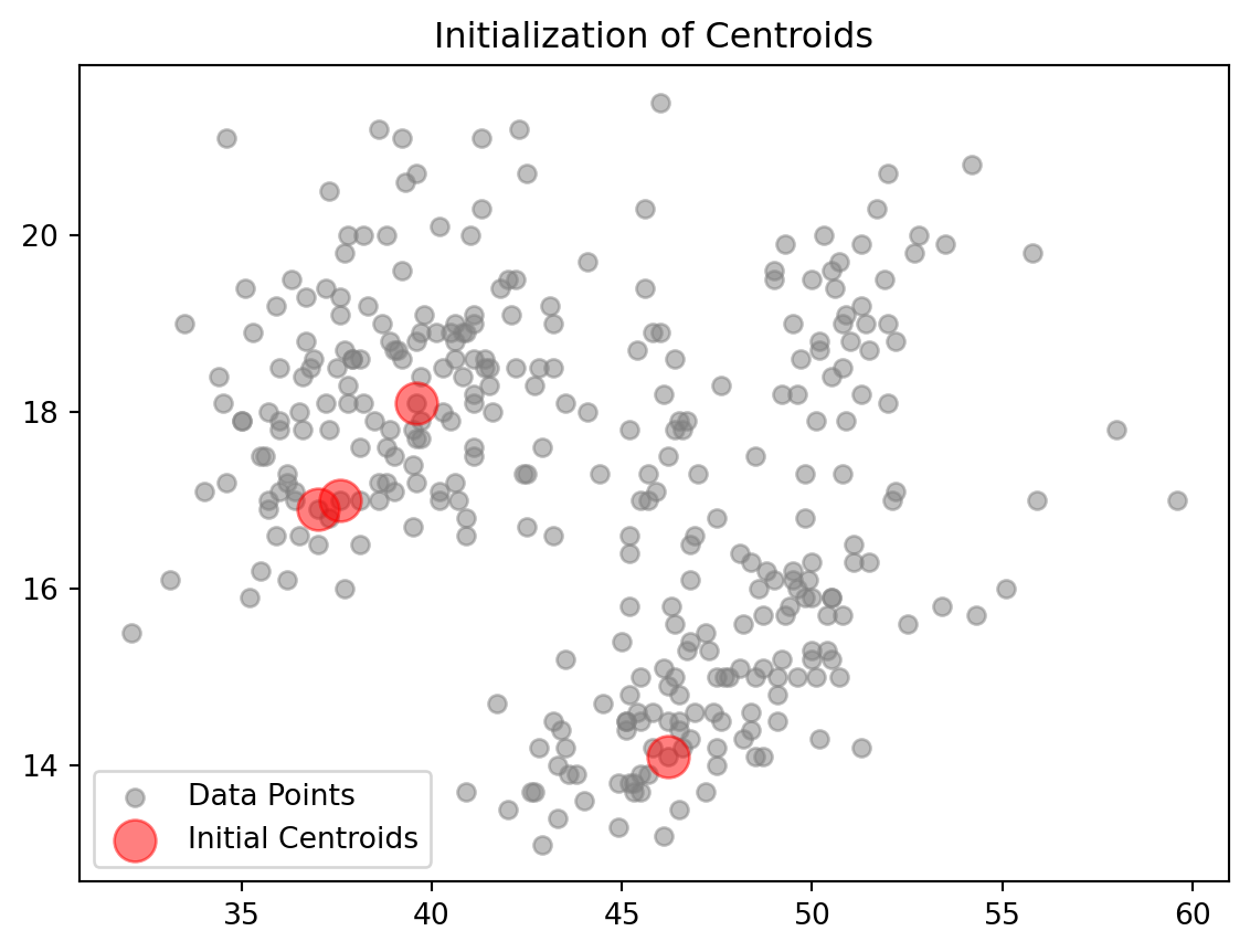



5. Evaluating Optimal number of Clusters
To evaluate the optimal number of clusters for k-means clustering, we can calculate both the Within-Cluster Sum of Squares (WCSS) and the Silhouette Score for various values of \(k\). These metrics provide insight into the quality of the clustering process, with WCSS indicating how compact the clusters are and Silhouette Score measuring how well-separated the clusters are.
def calculate_metrics(data, k_range):
    wcss = []
    silhouette_scores = []

    for k in k_range:
        kmeans = KMeans(n_clusters=k, random_state=0)
        labels = kmeans.fit_predict(data)

        # Calculate WCSS (Inertia)
        wcss.append(kmeans.inertia_)

        # Calculate Silhouette Score
        if k > 1:  # Silhouette score requires at least 2 clusters
            score = silhouette_score(data, labels)
            silhouette_scores.append(score)
        else:
            silhouette_scores.append(None)

    return wcss, silhouette_scores
def plot_metrics(k_range, wcss, silhouette_scores):
fig, ax1 = plt.subplots()
# WCSS Plot
color = 'tab:red'
ax1.set_xlabel('Number of Clusters (k)')
ax1.set_ylabel('WCSS', color=color)
ax1.plot(k_range, wcss, marker='o', color=color)
ax1.tick_params(axis='y', labelcolor=color)
# Silhouette Score Plot
ax2 = ax1.twinx() # instantiate a second axes that shares the same x-axis
color = 'tab:blue'
ax2.set_ylabel('Silhouette Score', color=color)
ax2.plot(k_range[1:], silhouette_scores[1:], marker='o', color=color) # Skip the first entry (None)
ax2.tick_params(axis='y', labelcolor=color)
plt.title('WCSS and Silhouette Score for Different k')
plt.show()k_range = range(2, 8)
wcss, silhouette_scores = calculate_metrics(penguins_numerical, k_range)
plot_metrics(k_range, wcss, silhouette_scores)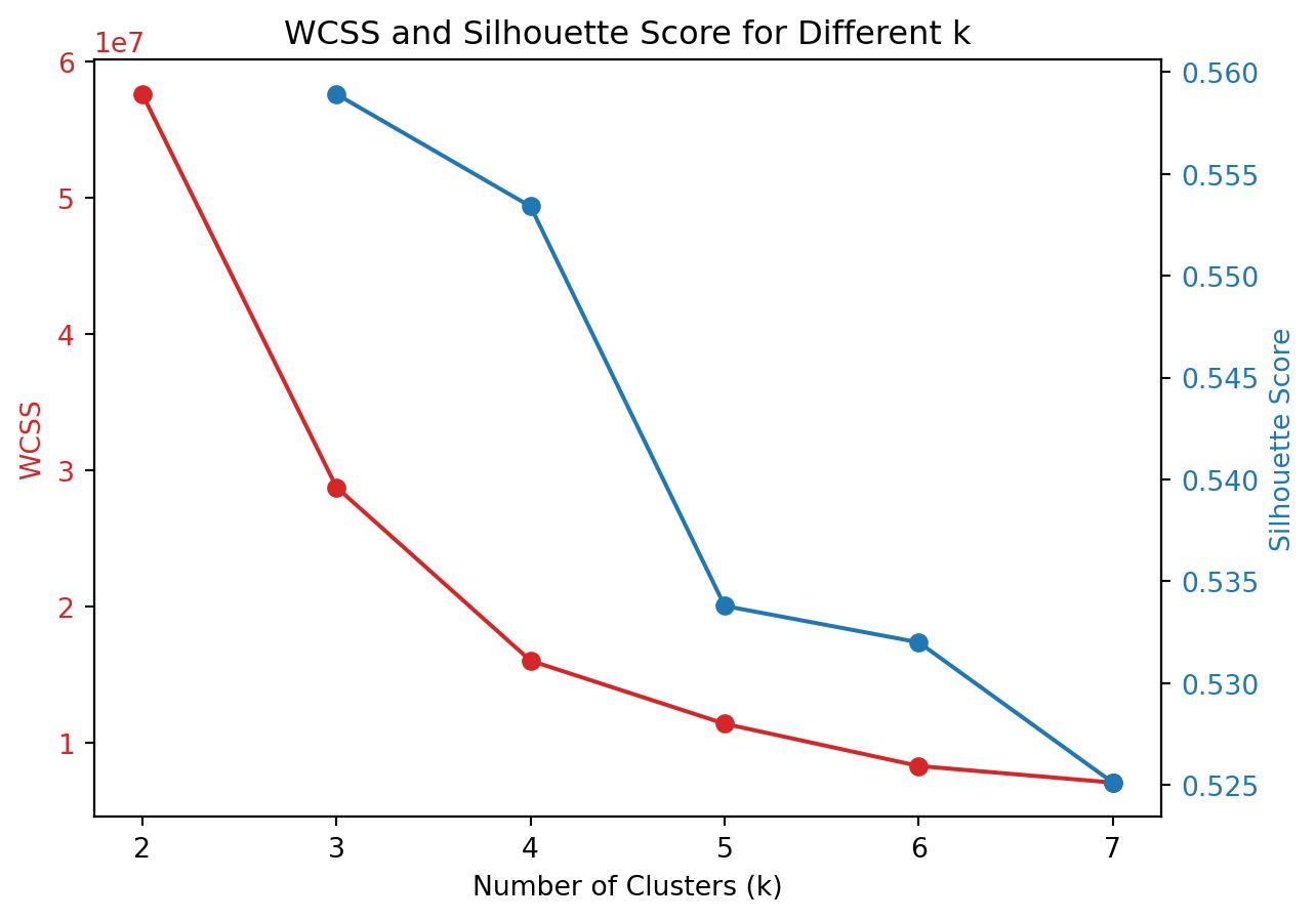
In the graph above, the red line represents the WCSS score. The WCSS Score is a measure of the total distance between each point in a cluster and the centroid of that cluster. The goal in k-means clustering is to minimize this value. We can use the elbow method to choose the k at which the WCSS begins to decrease at a slower rate. The point known as the “elbow point,” indicates that adding more clusters beyond this point does not provide much better modeling of the data. In the graph, there is a noticeable elbow around k=4, suggesting that increasing the number of clusters from 3 to 4 significantly decreases WCSS, but further increases in k (to 5, 6, or 7) result in smaller reductions in WCSS.
The Silhouette Score is represented by the blue line and is a measure of how similar an object is to its own cluster compared to other clusters. The value ranges from -1 to +1, where a high value indicates that the object is well matched to its own cluster and poorly matched to neighboring clusters. A higher silhouette score means that the clusters are well separated and clearly defined. From the graph, the silhouette score generally decreases as k increases. The highest score is at k=3, suggesting that at this level, the clusters are most distinct from each other compared to higher values of k.
6. Evaluating our custom Kmeans to Built-in function
We are now going to compare our kmeans function to the built in function via sci-kit learn.
def plot_clusters(data, labels, centroids):
    # Convert DataFrame to numpy array if necessary
    if isinstance(data, pd.DataFrame):
        data = data.values
    plt.figure(figsize=(10, 8))
    plt.scatter(data[:, 0], data[:, 1], c=labels, s=50, cmap='viridis', alpha=0.7, label='Cluster Points')
    plt.scatter(centroids[:, 0], centroids[:, 1], c='red', s=200, marker='X', label='Centroids')
    plt.title('Cluster Visualization with Centroids')
    plt.xlabel('Feature 1')
    plt.ylabel('Feature 2')
    plt.legend()
    plt.show()

k = 4
kmeans = KMeans(n_clusters=k, random_state=0)
labels1 = kmeans.fit_predict(penguins_numerical)
centroids1 = kmeans.cluster_centers_
plot_clusters(penguins_numerical, labels1, centroids1)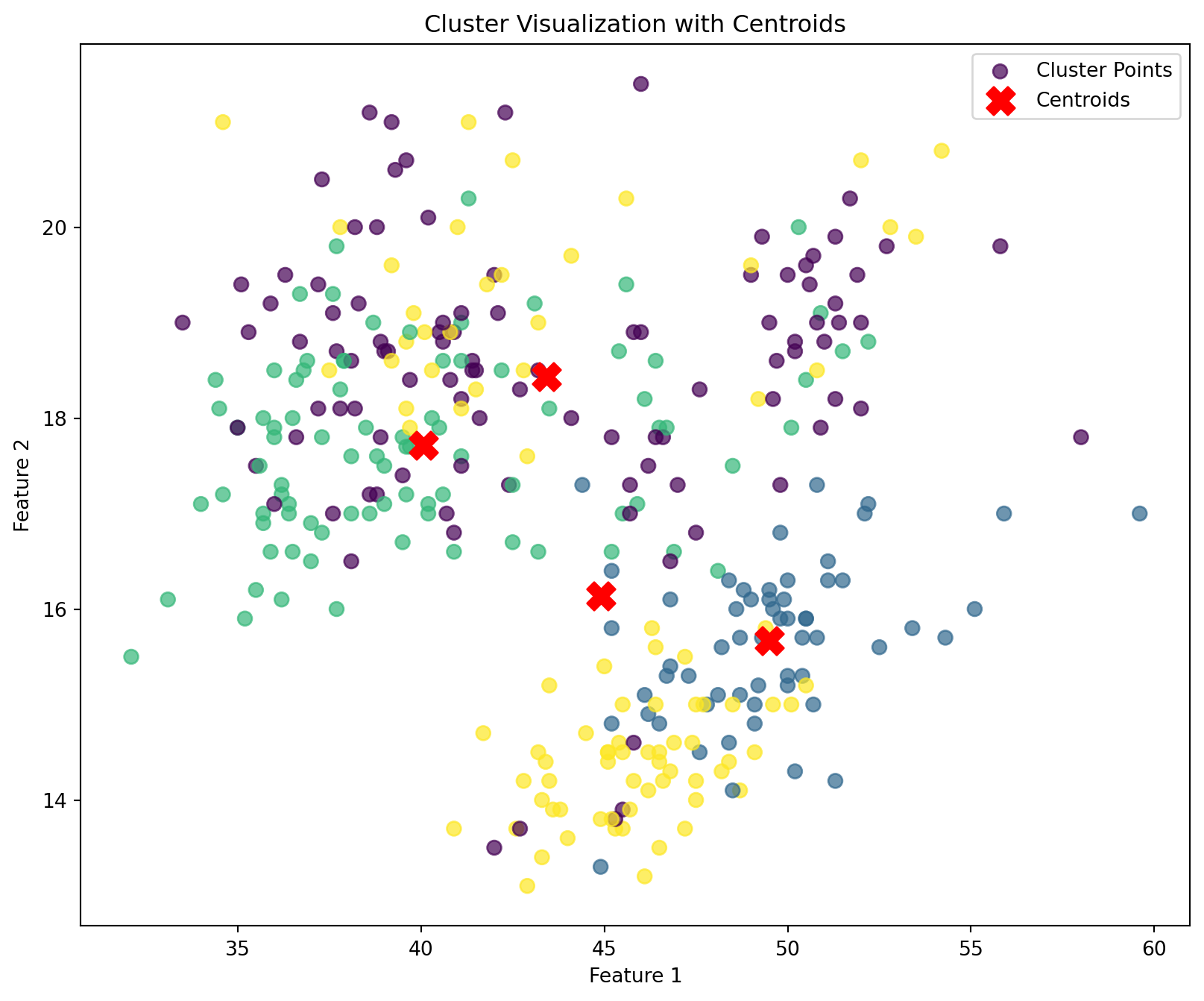
# Start the timer
start_time = time.time()
# Create and fit the KMeans model
kmeans = KMeans(n_clusters=4, random_state=0)
kmeans.fit(penguins_numerical)

# End the timer
sklearn_time = time.time() - start_time
print("Execution Time for Scikit-learn's KMeans: ", sklearn_time)
print("Execution Time for My k_means: ", my_time)
Execution Time for Scikit-learn's KMeans: 0.005724906921386719
Execution Time for My k_means: 2.431870937347412We see that when using the built in kmeans function to our own function, there is no noticeable difference in the classification of the clusters. However, we do see quite a difference in the execution time between my kmeans function and the built-in function. We can see in terms of the execution speed, the built in library still outperforms our own kmeans function.